Klarna.com
Interface | Interaction | Experience
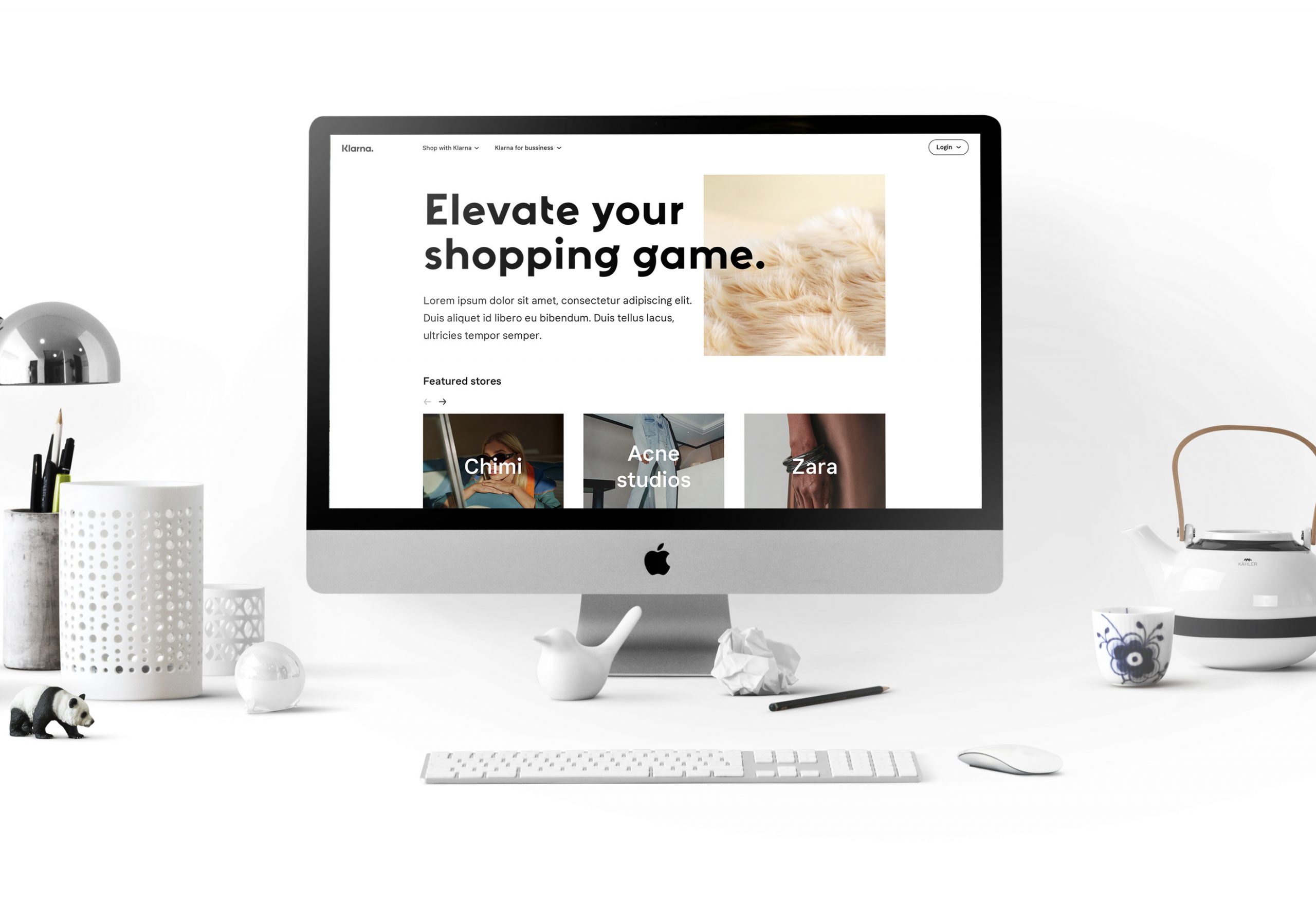
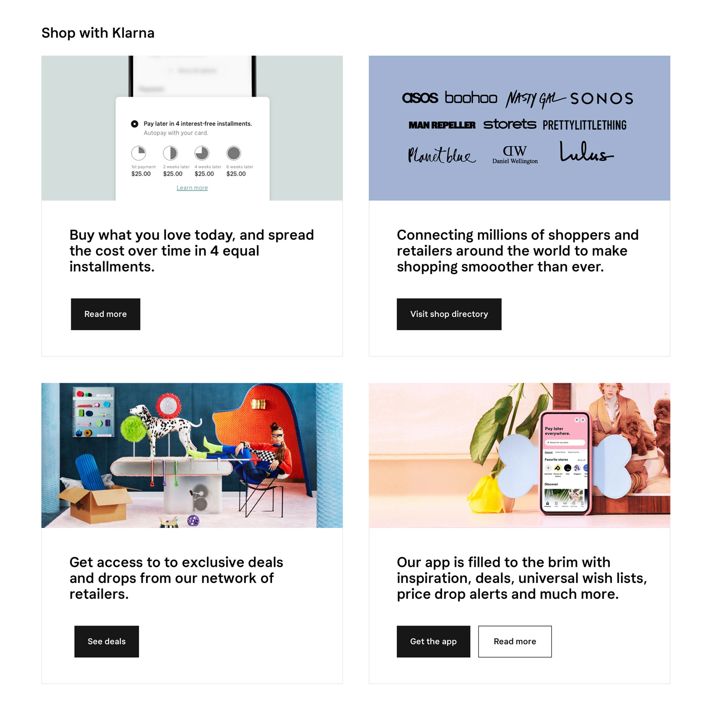
Klarna.com was redesigned to offer consumers a more interactive shopping experience. Consumers who were interested in shopping would now have instant access to their favourite stores and they can also now view the new offerings from these stores all in one place.
Scope
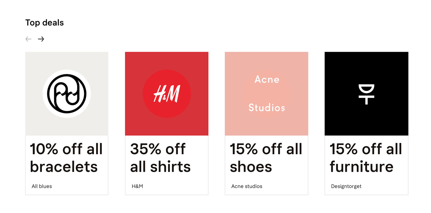
Work with internal and external stakeholders to redesign the experience of the website. Make Klarna.com a one stop solution for consumers shopping needs. Website should help consumers with their shopping needs by providing information about sales and discounts.
Launch
December 2019
Teams
Design
Development
Product
Company
Klarna
Market research and benchmarks
Before actually getting into the designing phase we analysed the market and identified our audience. We tried to map out their pain points with current solutions and then created some benchmarks for our experience and design.
Framework and layout
Business requirements along with user expectations paved the towards site maps and basic user flow. That user flow was then translated into wireframes. A skeleton structure of the website was created.
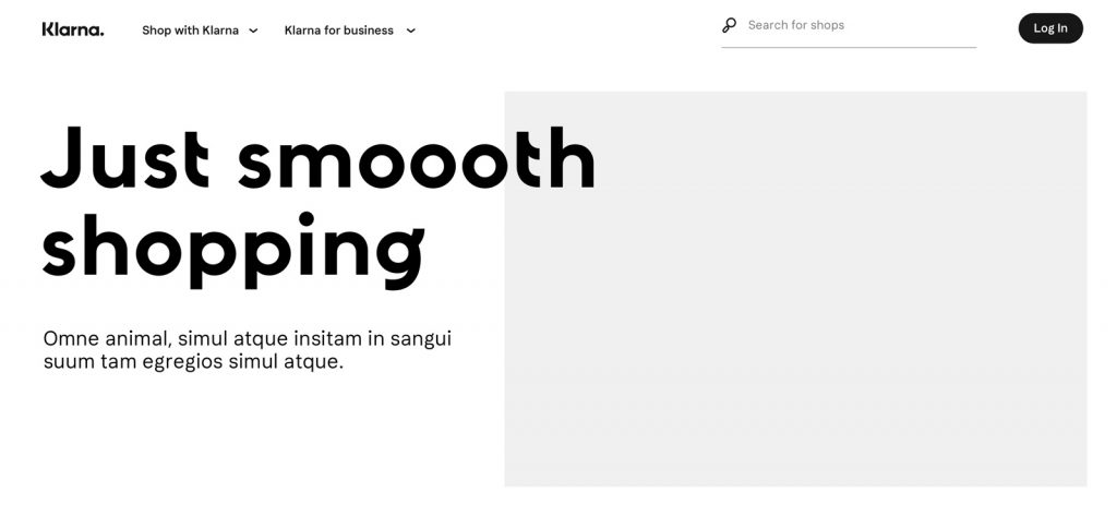
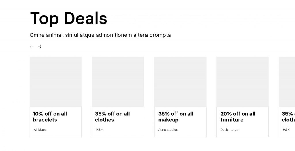
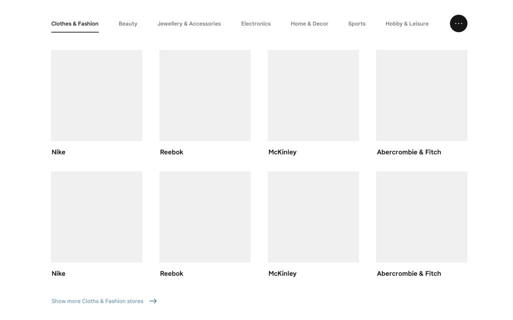
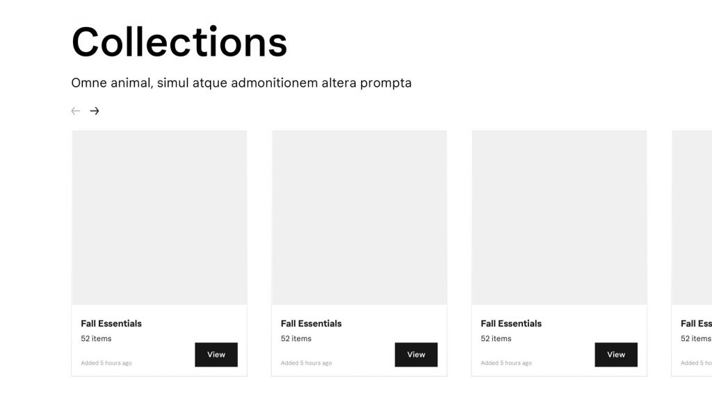
Website pages were divided into sub sections. These modular sub sections were dynamic and could be moved based on users behaviour and preferences. This approach made the website more user friendly and smart.
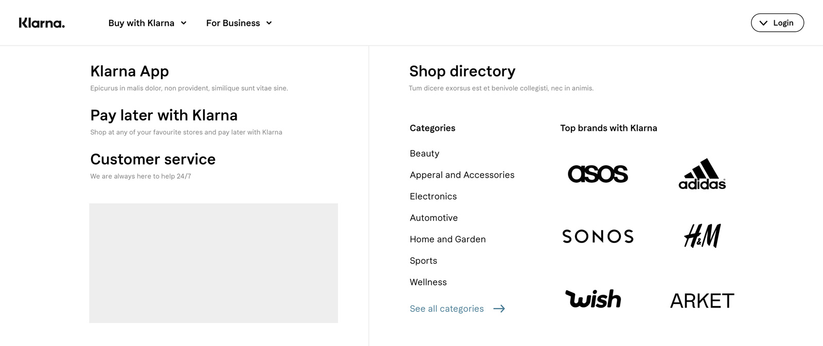
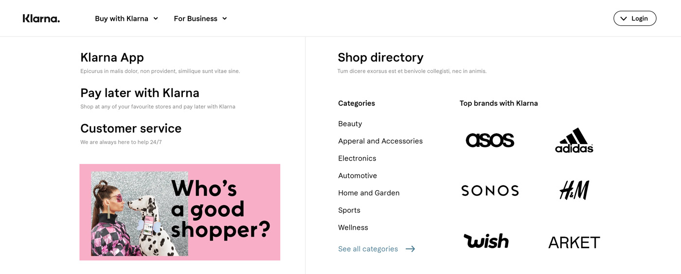
The main navigation was redesigned as well. It was focused on the main user needs. The new navigation was made compact with only the relevant information.
Interactions and transition
Interactions and transitions were added to modules based on their importance. This made the website more interactive and delightful.
High-fidelity Designs
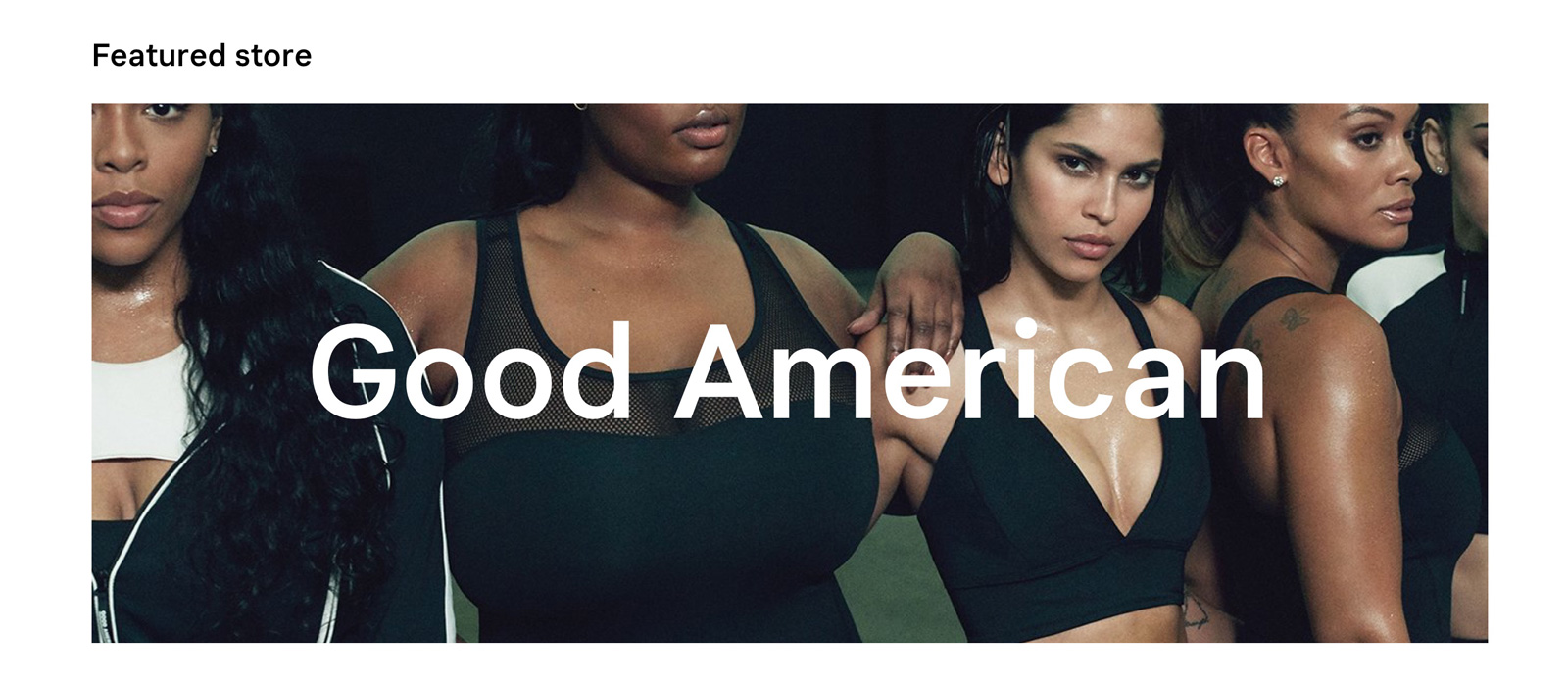
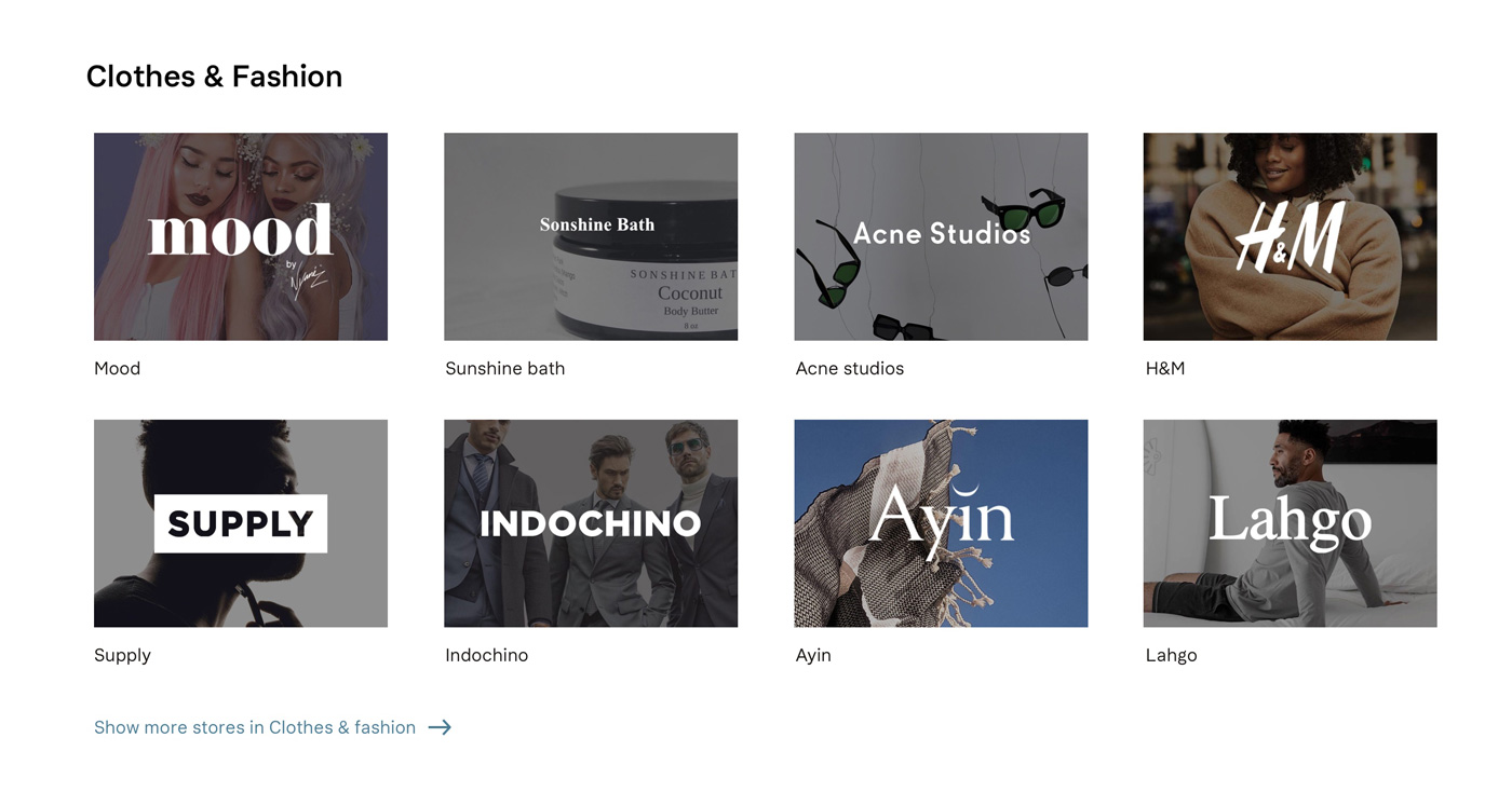
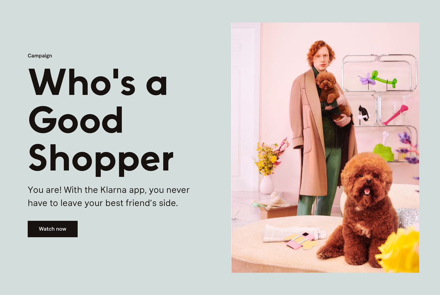
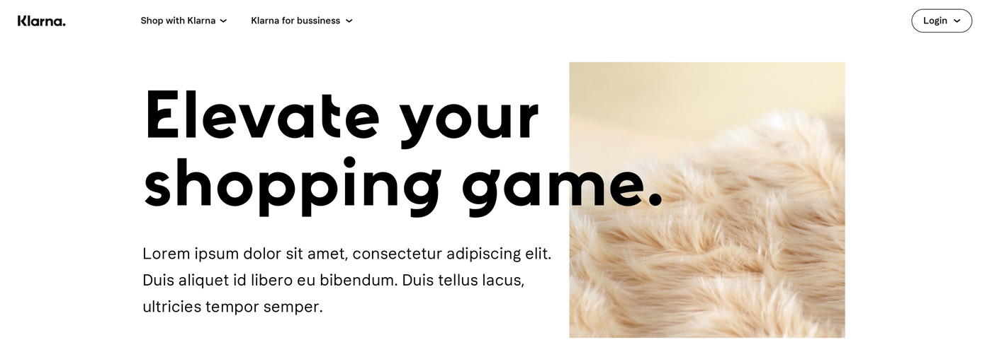
After iterating on wireframes, high-fidelity interface designs were created using Klarnas powerful design system components. Some UI components were custom designed to fulfil the requirements.

+300%
Increase in overall click through rate
18%
Decrease in bounce back rate from 52% to 18%
12%
Increase in unique page-views
